Fernis is a platform that combines artwork management, inventory tracking, and documentation collection for gallerists.
The Fernis Gallery System app prototypes were built, at first, without any design system. In order to maintain consistency, both visual and functional, I designed the Fernis Design System.
Timeframe of the project: 1.5 Months
We shortened the prototyping time, being able to reiterate faster on our designs and adjust functionalities accordingly.
By iterating faster, we were able to have more conversations on how to further develop each prototype.
Since we are two designers at Fernis, the UX Design of the design system itself evolved so we both can find the right component with its relevant variants. This makes our prototyping iteration frictionless.

The Fernis Design System was built using the Atomic Design methodology.
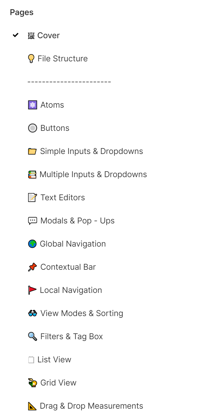
The Design System was organized using pages. Each page contains groups of UI components that have similar functionalities and UI design.
Based on the Atomic Design methodology, the Fernis Design System has on its first page, the Atoms page, a display of Text Styles, Color Styles, Grids, Icons, and Effects used to create the subsequent components.
The following pages contain components that subsequently increase in complexity.
The Fernis Design System was built to prototype our desktop app. In the future, these components will be adapted to smaller devices such as tablets and mobile.
The current visual style is still in development, however, the visual design took into consideration principles such as contrast and color for accessibility, target point sizes for future implementations on mobile devices, and a minimalistic graphic design.
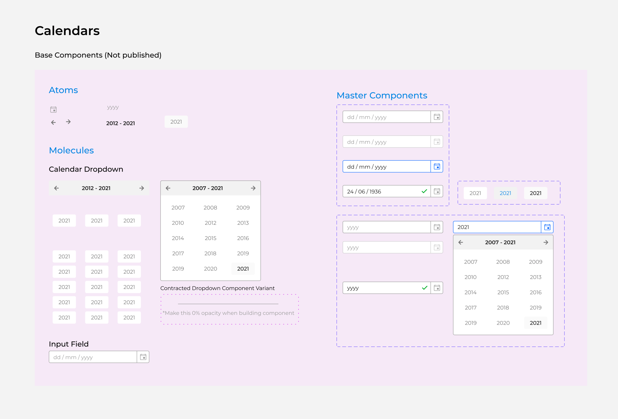
Each component was designed based on Local Master Components, such as text labels, icons, and containers, that grew in complexity when grouped and interactive behaviors were added. Local Master components are components only used to build the Fernis Design System. These components were kept local by using the prefix “.” in front of the component’s name, therefore not being published to other Figma files.
In order to make sure that everybody in the team understood which components could be reused and which ones were Local Master Components, the latter was displayed on top of a pink background.
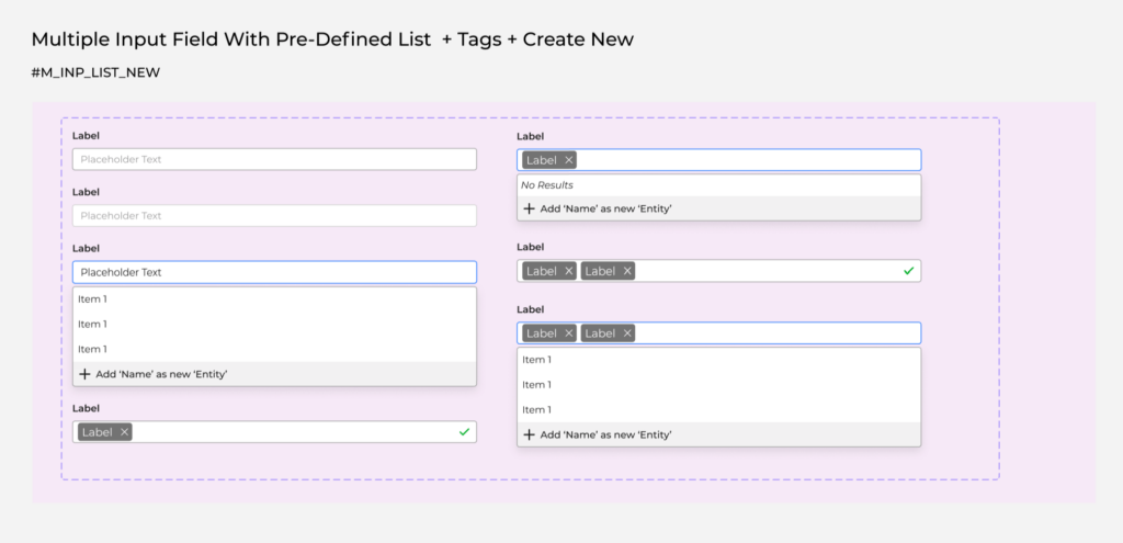
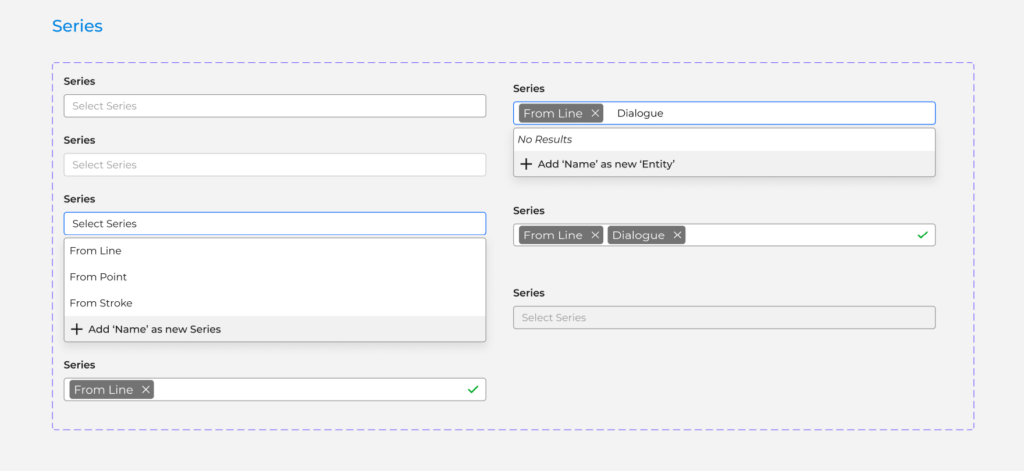
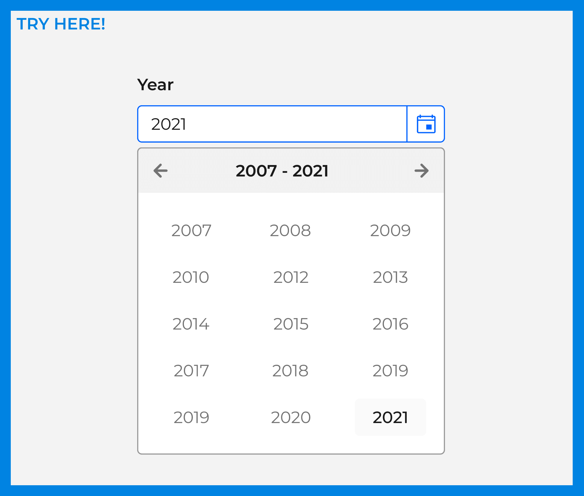
The Fernis Design System is being used by many team members. In order to make it easier to try each of the elements presented in the Design System, a Try Here Frame was added so team members could try the functionalities when entering Presentation Mode.
An Internal Manual was written so everybody in the team can understand better how each component deals with specific functionality, and how the latter is connected to the user journey. This manual, as well as the Design System will evolve as we update our components and design solutions.